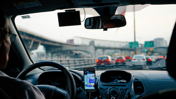
Automotive navigation, are we there yet?
Despite advances in GPS experience design in recent years, a major problem persists: GPS navigation tools don’t enable drivers to anticipate next steps – unless of course they fix their eyes the screen rather than the road.
We recently discovered Hudway, an iPhone app that offers a heads up display for GPS navigation. Making use of the windshield area, the app displays information and guide marks directly in the driver’s field of vision.
We tested the app under several conditions. Here’s our evaluation:
The positives
Navigation in conditions of poor visibility
This is one of the major benefits of the app. Because it projects information about intersections and turns from the driver’s perspective, it enables drivers to anticipate upcoming maneuvers – no matter how complicated.
Speed display
In addition to navigation, useful information like current driving speed is projected onto the windshield. Those who’ve tested this feature consider it very useful to be able to check their speed without taking their eyes of the road.
Points for improvement
Information visibility
We mentioned that one of the app’s benefits is its capacity to communicate key information by projecting it on the windshield. However, it’s worth noting that because sunlight lowers the contrast between the projected information in the foreground and windshield in the background, information is difficult to read during the day.
We recommend: Unfortunately, it’s difficult to think of a viable alternative for a smartphone. The only way to solve the contrast problem would be to increase the luminosity of the projected information beyond the smartphone’s capacity. Still, it’s worth noting that several automotive manufacturers like BMW use this technique to achieve high-contrast information display in any ambient lighting condition.
Height and positioning of information
In both trials we ran, the same problem surfaced: the information displayed is too small and positioned too low on the windshield to be read easily. Both testers noted that the time and attention needed to parse information posed a risk to safe driving.
We recommend: Again, this problem is the result of a platform limitation. Normally, a windshield display ought to project information within the drivers’ field of vision so that they don’t need to look elsewhere to get guidance or information about their next moves. If this is the intention, the projection ought to span the entire windshield area rather than just a small portion. We note that drivers using tablets enjoy a better experience than those who use smartphones since the projection spans a larger area.
Frequency of information updates and use of the colour red.
The distance and navigation information that’s projected on the windshield are updated in real time. Our drivers remarked that the frequent information updates constitute a distraction, competing for attention as drivers attempt to focus on the road. Furthermore, as soon as drivers approach an intersection, the colour of the displayed information changes from white to red. This change tends to needlessly capture drivers’ attention. One driver even misunderstood the colour change as an indication that he had made a mistake.
We recommend: If information needs to be updated frequently, consider using soft and subtle transitions in order to avoid needless distraction to the driver. Moreover, the colour red should generally be avoided unless it’s meant to indicate danger. To communicate critical information, consider using blinking or rapid transitions instead.
Conclusion
As devices become smarter and the GPS navigation experience evolves, methods like augmented reality and windshield display become more prominent. It’s interesting to consider the options afforded by smartphone which constitutes a more accessible entry point to developpers than built-in components. Despite the issues posed by the constraints of the smartphone, we salute Hudway for this latest concept which helps democratize the dashboard display approach to in-car navigation.
Source: New feed
0 Comment(s)