28
Mar 2014
Find the mistake…
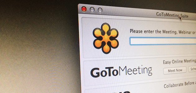
One software: GoToMeeting.
Two versions of it: one that we install on the computer, the other available online.
Two ways of displaying the same information.
The first question that comes to mind is why these two screens differ. One of the most important principles in user interface design, and user experience in general, is consistency. Especially in this case, where the feature being presented is the same. And we are not talking here about mobile vs desktop. They are both “desktop” versions.
Having two different ways of displaying the same information would not be that problematic if the usability of both was good. But this is not the case.
In one of the screens, there is a very obvious usability error, at the audio options. One that often causes us a lot of trouble whenever we are planning a new meeting.
Would you be able to find precisely what is wrong and in which of the two screens it is?


0 Comment(s)