We tested: Peek Calendar
So last week another calendar app appeared in the Apple App Store and suddenly everyone’s talking about it. This app, Peek, is for the sort of person who doesn’t spend time managing their time. In short, it’s for normal people.
Square Mountain, the company that created the app, decided to study how “normal” people manage their time.
Here’s our opinion on the topic:
Conceptual model
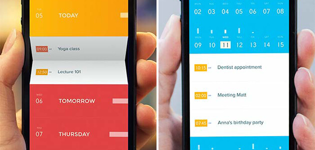
Conceptually, the app captures the basic questions we ask when we talk about time management. Rather than showing a simple calendar, it emphasizes upcoming events presented on a timeline.
Visual experience
The visual experience is probably one of the reasons why this application has created such a stir. It maintains simplicity, in line with the philosophy of flat design, but the folks from Square Mountain didn’t simply ‘dress up’ the application. Attention to every last detail including transitions and animations makes this app an exemplary piece of micro-interaction design.

We consider this a good attempt as far as interactions are concerned: it’s generally risky to attack a design problem that iOS solves natively – and it’s easy to fall into the trap of adding complexity under the pretext of innovation. In this case, we salute the effort invested in rethinking the way in which a time is selected. Peek allows the user to view all options at once and make a selection in a single tap. No more awkward attempts to select a time with the iOS ‘spinner’ – not always an easy task.

Choice of iconography
It’s a challenge to create an app that’s based completely on visual language. And it’s not always clear what a button does. Exploring Peek, you can make some nice discoveries, for instance, try tapping on a round label, it becomes a clock and you understand immediately. This sort of behaviour isn’t always Kosher in UX, but it does highlight an important aspect of mobile design, namely, the importance of letting people explore an interface freely, without fear of error. In this respect, Peek accomplishes the mission.
However, sometimes you encounter icons that are difficult to interpret and since there isn’t always feedback when you tap, there’s some functionality that we were only able to understand by visiting the website and reading the tutorial (!)
We suggest: Ensure clear signposting throughout the application – either in the form of feedback, labels, or instructional messaging.
Let’s agree on one thing: in mobile context of use, most people are familiar with 2 gestures: tapping and sliding (flick, swipe, drag.) The most important interactions in this app demand long taps (long press / tap and hold.) For instance, you need to long-tap the label ‘Today’ in order to create a new event today. We see this as the app’s biggest flaw.
We suggest: If this application is meant to target ‘normal’ users, it would be better to stick to well-known gestures and to provide more explicit buttons. We can also imagine providing more guidance to show users how to carry out basic tasks.
Apart from these points for improvement, Peek is a definitively interesting app. We’d love to see it push the currently established limits of mobile design. Certain aspects of the experience have yet to be resolved but if the user research practices at Square Mountain persist, we believe this will become an inspirational app!
.png)
Source: New feed1
0 Comment(s)