
How to make those frustrating automated response systems accessible Part 1
Automated telephone systems (also called Interactive Voice Response systems, or IVRs), whether in private companies or offices, don’t respect best practices in the design of voice user interfaces and in particular don’t adapt to their users’ reality.
These interfaces remain very complex to use. They are often a source of frustration for most citizens and particularly for aging or illiterate people. (Note that 1.3 million Quebecers are illiterate.*)
We present here the first of a series of blogs about the accessibility of IVRs.
As a company specialized in user experience design, we collaborated with the Literacy Centre “La Jarnigoine” in the Villeray district of Montreal in order to improve the accessibility of these phone systems.
This collaboration also had the goal of reducing the marginalization of illiterate people, who often rely more on phone calls as compared to those who can use other means of communication (Internet, tablet applications, smartphones, etc.).
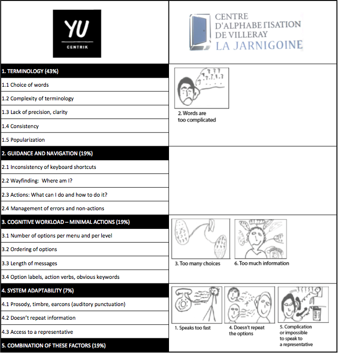
Here are the 5 most frequent errors that Yu Centrik identified in our evaluation and design projects for these systems:
- 43% of problems: Terminology (choice of terms not adapted for the audio mode, etc.)
- 19% of problems: Guidance and navigation (number of options, etc.)
- 19% of problems: Mental workload (length of messages, amount of information, etc.)
- 7% of problems: Adaptability (access to a representative, prosody, articulation and vocal timbre, etc.)
- 12% of problems: Combination of two or more of the above factors.
Here are the 6 problems that the learners at the Literacy Centre “La Jarnigoine” identified:
- Speaks too fast
- Words are too complicated
- Too many choices
- Doesn’t repeat the options
- Complication or impossible to speak to a representative.
- Too much information
Drawing is the preferred tool of illiterate users for explaining each of these problems. Here are their illustrations:
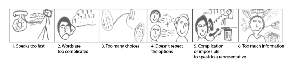
Example: Problem 3 – Too many choices
The two bubbles represent the number of choices available in different menus (often too many, up to 9 here). They are linked to the ear, which listens to all of these options.
Here is a comparison of the two sets of criteria used:
In the next blog, we will detail the possible solutions for terminology problems.
* According to an international study:
http://www.rgpaq.qc.ca/dossiers.php?id=1
0 Comment(s)