Thumbs up, thumbs down

KDE Dolphin a innovative file manager
From Nadir Ghezzal
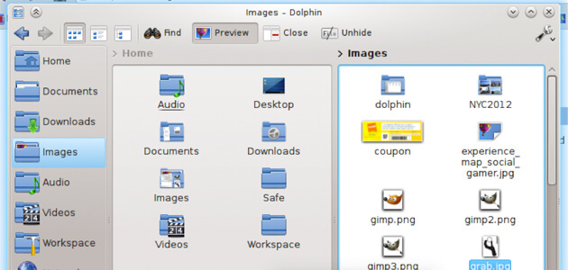
Dolphin is a free and open source file manager included in the KDE Software Compilation. Dolphin posses a lots of functionalities to improve UX such as :
- Breadcrumb navigation bar – each part of the URL is clickable
- 3 view modes (Icons, Details and Compact), remembered for each folder
- File Previews
- Split views (for copying and moving files)
- Network transparency – using KDE’s KIO slaves
- Undo/Redo functionality
- Tabbed navigation
- Renaming of a variable number of selected items in one step
- NEPOMUK integration (including search, tagging, rating and commenting files)
- Places bar which also integrates with Kickoff’s, “Computer” tab
- Sorting and grouping of files by name, size, type and others
Why I choose it? – Because it is a very powerful file manager that have a lots of features to improve productivity.
Product reviews on B&H website
From Pierre-Alexandre Lapointe
This online boutique for professionals offers an interesting feature. They simply display the two most voted positive and negative user reviews of product side by side, so the user can in most cases have a good idea of the product’s qualities and flaws rapidly.
Why I choose it? – This features somewhat acts as a summary of the user reviews for a given product, so it’s really helpful if you are comparing many similar products before purchasing and don’t have time to read all user reviews in detail. However, this kind of feature requires many reviewers on your site and enough traffic to ensure that the reviews are themselves rated by the customers…
The Focus of Attention
From Joëlle Stemp

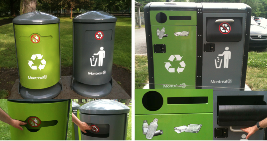
I was questioning myself about the news trashcans that we can find at the Lafontaine park. A first version was placed 2 weeks ago and a second appeared the following week.
- I think the first version of the recycle bin was, for me, a little difficult to quickly interpreted ( 2 types of identifier and interpretation : the logos at the middle of the trashcan and the contradictory signification at the center of the opening). The trashcan was also less practical because you had to put your hand inside the trash to throw your wastes. We don’t know where we are putting our hand and what objects we could touch doing (we all know how this closing system can easily become dirty. Also, the opening was to little which made the impossible to throw big wastes.
- The newest version of the recycle bin with his visual representation made it easier for someone to identify what he can throw inside. The trash, with his drawer system makes it easier for the throwing of wastes, the flexibility of the volume and there is less fear because the black hole is gone.
What do you think?
Source: New feed1
0 Comment(s)