How does your site look on an iPhone?
The iPhone’s landing on Canadian soil, as I already mentioned in my previous blog, provides us with a new platform and a whole new paradigm of human-computer interaction.
Until we have the real iPhone in our hands (Quebec launch date is July 11th… yes I know, we are way behind), I wanted to help you imagine its browsing experience using a few Quebecoise websites. We used Apple’s simulator to generate the screens in the portrait and landscape formats you see below.
In today’s post, we’re only simulating news sites… but in the coming weeks, screenshots of sites in other categories will make their appearance on this blog.
You will quickly see that, even with the drastically improved display and overall experience when compared to other cellular phones, the iPhone’s own unique constraints will call for adjustments in order to optimize interactions and make these sites “usable”. Here are some examples:

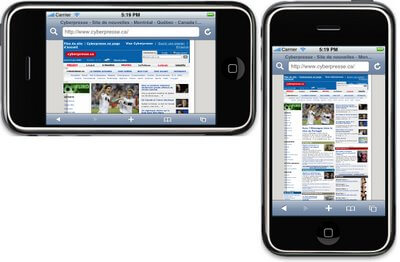
Cyberpresse

Radio-Canada

Le Devoir

Canöe

The Gazette
Here are two examples of financial news sites:

Les Affaires

La Presse Affaires
In fact, the user experience shown here is limited to the default browser. It does not account for the possibility of zooming, scrolling and other technological advancements made by the iPhone. Still, it’s clear that that users will not use the phone the same way they use a computer; you can’t expect users to perform the same manipulations that they would on their regular computers.
For example, mobile application users are less tolerant of performance problems and hard-to-use interfaces because their service providers are charging them for airtime. They expect interfaces to be even more simple and direct. Hence the vested interest in optimizing sites for the iPhone.
You might ask if it’s worth the cost to optimize sites for the iPhone only, especially since we don’t even know the penetration of the product in Quebec and Canada yet. In fact, the trend is that other suppliers are following Apple’s model. Not only are we optimizing for the iPhone, but any other similar platforms. Other manufacturers have already begun to discuss similar products with a browser comparable to the iPhone’s Safari. Now is the time to work to make sure we don’t miss the boat, as many did when the Web first arrived 15 years ago. Don’t you remember? Some businesses didn’t want to invest in building a so-called “website” because the “Internet” was a temporary phenomenon.
Stay tuned for more posts on the subject in the coming weeks.
0 Comment(s)