Brainsketching
We at Yu Centrik are really excited about Jay Vidyarthi’s “Brainsketching” article, recently published in User Experience magazine (March 2014). Jay used to work at Yu Centrik, where he and the team designed an online statistical database for the UNESCO Institute for Statistics (UIS) using the brainsketching method.
Jay claims it “might be one of the best and most versatile tools to use”.
But how does it work?
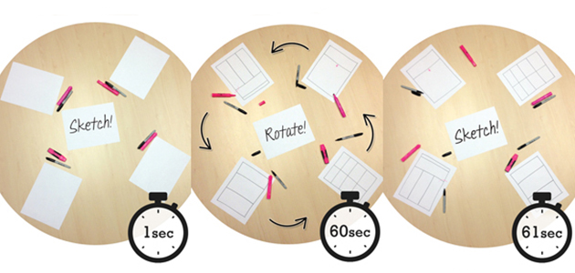
You sit 6 stakeholders around a table, arm them with pens and paper, and ask them to draw design concepts or write functionalities of the interface in 60 second intervals. When that time is up, they pass their paper to the person on the right. The exercise continues until everyone around the table has contributed to each sketch. Once complete, you will have 6 different concepts that will help establish objectives and guide future design.
This technique, mentioned in a book from the 1980’s called Techniques for Structured Problem Solving, is already used in different contexts: in written forms of brainstorming called “Brainwriting”, or even in drawing class.
As Jay mentions, having all stakeholders take part in the process strongly clarifies their common goal. Some stakeholders are not designers and won’t be able to draw, but the point is to involve everyone and get their insight down on paper in order to prioritise key features for the interface.
In a design field where collaboration is key to complex design challenges, it’s more than a tool, it’s a “value of design democracy” underlines Jay.
“Each person is forced to quickly understand and build on the idea.” “Even if people bring pre-determined ideas to the table, they may define the general layout of one sketch, but the other three sketches will demand that they think in different ways” he explains.
The technique is even more “democratic” if you use markers of the same colour: individual input gives way to a solution as a whole.
At YU Centrik we’ve been using this powerful technique, with some small adjustments. We spend between 1 and 2 minutes per round since most stakeholders need a little more time to jump into a sketch. At each interval, we also allow them 15 seconds to explain their sketch to the next person to help avoid confusion.
We’d like to thank Jay for this article. We know the proverb “Alone, we are faster, together, we go further”, and this technique unifies these ideas: “Together, we go faster and further.”
————
To read Jay Vidyarthi’s full article, go to : http://www.usabilityprofessionals.org/uxmagazine/brainsketching/
0 Comment(s)