
Design for Communication with sketch
As I was opening a CAMINO chocolate bar, I saw this drawing on the packaging. This got me thinking about how large of a role sketching plays in explaining concepts in our day-to-day lives.
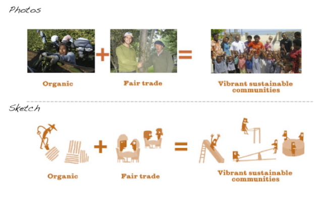
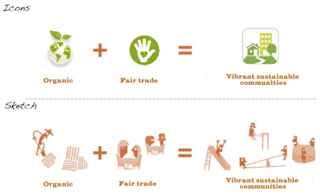
In the case of Camino, a sketch is being used to explain the company’s philosophy based on an equation: “Following the rules of fair trade when producing organic chocolate promotes sustainable development.”
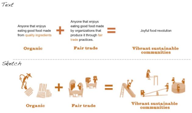
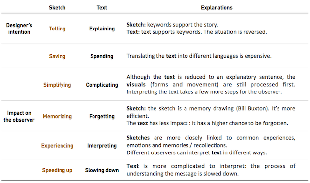
The approach was described in six words and three drawings on the packaging. I described it in 13 words. Seven less words to be translated in various languages, we already see an advantage of associating text with illustrations.
As for the 3 sketches, there is nothing to translate. If they were well-tested, the images could be explicit enough to be spread internationally and be understood by a large audience, regardless of their country and language spoken.
Just in case they are not explicit enough, the text provides missing keywords.
I could also cite relevant examples of airplane security and IKEA furniture assembly instructions
In the past, image was used to support text, bringing further clarity to a message.
Today, text completes image.
Still, a question remains: why does the sketch have so much impact on us and why are designers using it more and more in product design, services, telecommunications, advertisement, documentation, training, etc?
Let’s try to answer this using a small exercise.
Let’s compare sketches and photos.
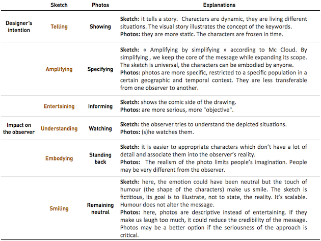
To what extent does this dimension change the message conveyed by the designer and received by the observer?
In this situation, we can see that sketching is a more effective way to communicate an idea, concept, or philosophy to a large audience because:
– visuals are processed first;
– presented situations are linked to people’s experiences without giving too much detail (which tends to slow down processing of the message);
-the sketch amplifies the meaning of the message by presenting a tiny story which can be understood and easily remembered by all (and can often make people smile, too).
The sketch can be very seductive but, as illustrated by Camino, it is inseparable from keywords which specify its message and “lock its meaning” (Scott McCloud, Faire de la bande dessinée).
So go forth and sketch!… but remember to associate some text.
References
. Bill Buxton, 2007, Sketching the user Experiences – getting the design right and the right design, Elsevier Inc.
. Scott McCloud, 1993, Understanding Comics: The Invisible Art
. Scott McCloud, 2007, Faire de la bande dessinée, Paris, Delcourt, 2007
Read more blogs on the subject
Why (do) we sketch?
http://www.uie.com/articles/why_sketching/
http://keepthenoisedown.typepad.com/keep_the_noise_down_blog/user-centred-design/
http://www.simplestroke.com/wp/?p=64
Source images
Photo – CAMINO
http://2.bp.blogspot.com/-UptJac8-y1k/TYanXhBP8rI/AAAAAAAAA5U/L6BqiYAd72E/s1600/camino.jpg
Photo – Biologique
http://www.zimbio.com/pictures/DbdrtTesv53/Migrant+Workers+Employed+Colorado+Largest/rBePyZssvD_
Photo – Commerce équitable
http://maineroot.com/?page_id=95
Communautés développement durable
http://www.thejetnewspaper.com/app/uploads/2011/09/KINDERGARTEN-VISIT-webcopy-254×134.jpg
Icons
http://www.seoguruji.com/images/icon_organic.gif
http://www.green-living.com/designimages/icon-fair-trade.gif
http://www.shu.ac.uk/business/sites/all/themes/zen/shu/assets/sustainability/communities.png

0 Comment(s)