24
Feb 2010
Mobile Devices and Context of Use
Here’s an example of what not to do in UI…
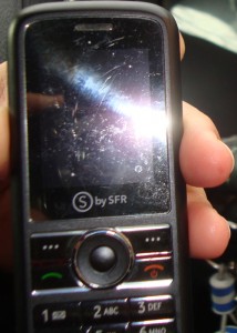
Consider this low-cost “pay-as-you-go” cellular phone from SFR in France. It seems to work fine as a mirror, but fails miserably at the simple tasks for which it was designed (making and receiving calls).
We must never forget this basic principle of design: CONTEXT OF USE. In the case of a mobile device, ensure that the physical components and screen contrast, among other elements, are still effective in broad daylight and sunny environments.
Obviously, this provider has failed these minimum requirements.
0 Comment(s)