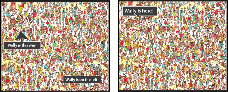
Where is the garbage can?

When we evaluate digital applications, the main weakness we often notice concerns guidance. Guidance can involve for example accompanying the user at each step of the process, helping them make a choice or making it easy to find a piece of information. Very often, either in the digital world or in our daily lives, either there isn’t enough guidance or it’s not clear enough.
Here is a simple example.
Location: A public washroom in a restaurant.
Goal: Find the garbage can.
There’s a big space under the sink, but where is the garbage can?
.jpg)
Here’s a hint on a handwritten sign that you notice as you wash your hands: “The garbage is on the left behind you. Thank you!”
You look to the “left” (first term that you read). But there’s nothing there.


So you turn in the other direction. Another sign: “Garbage”, with a direction indicator.

Here is the famous garbage can. Strange to see that the research element is the only one to not be identified.
.jpg)
Considering the number of signs, people must have searched for this “precious” object many times.
The guidance is there but in the end it makes searching for the target more difficult.
The garbage can blends with the rest of the elements and it’s understandable to want to make it less prominent.
But sometimes it’s better to aim for simpler and more direct guidance, with some allowance for learning by trial and error, rather than more elaborate guidance.
In this case, it would have been simpler to just label the garbage can with a sign saying “Garbage”.
Moral: in your design, always try to see if there is a more simple and direct solution. If it doesn’t exist, maybe the object itself is problematic.
0 Comment(s)