Using Flash to Prototype Voice Interfaces
It is often necessary to use fairly complex tools to perform usability tests on voice interfaces (cf. Nexus[1], Database Systems Corp.[2]). One of our projects involved a touch-activated automated telephone information system. We required a test solution that was flexible, easy to build, and which provided a relatively natural simulation of a telephone call that would allow us to capture the call and a certain number of events during said call. It also had to be easy to modify and not too expensive.
We therefore developed a simple flash utility that was adapted to simulate a user’s phone call into a voice interface. It had the following characteristics:
1. Easy to use interface;
2. Not demanding: running this kind of application only requires an Internet explorer and a FLASH player;
3. Simple to modify: tests were iterative, so changes were made to the application’s structure after each test (three in all);
4. Allows the user to manage streaming video and audio. Works with video and audio recording software;
5. Helps collect and analyze data: for every call, the tool allowed us to capture the type of button pressed, the steps taken through the voice interface, the amount of time spent listening to messages, etc… All of these data are critical for performing an in-depth usability analysis of any voice interface.
6. Easy to transfer to other voice interface applications.
7. Not too expensive: a FLASH developer developed this tool for us in two weeks.
Tool Description (Front End)
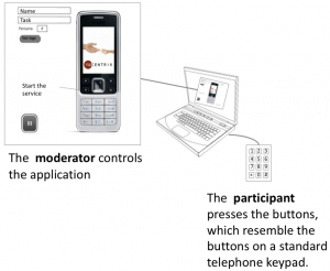
A simple screen reproduces a virtual telephone, which only the moderator can see and operate. Participants hear the instructions and press the buttons on the external numeric keypad to move on to the following instructions. Voice prompts are played on the computer’s audio port.
The moderator can record the participant’s name and surname, as well as the type of scenario and persona. The moderator launches the application; stops it whenever the participants are finished with their tasks; can interrupt the process at any moment during playback; and can replay any section.
During the call, the buttons the participants touch appear on the screen one after the other. Thus, the moderator sees in real time what steps the participants took. It also helps avoid errors in note-taking and compile the interface’s critical points quickly between participants.
Logs are also available to retrace the in-session keypad interactions: number of times zero was pressed, time spent inactive, etc…
Control System (Back End)
The interface’s structure management application assigns a telephone keypad key to each menu option. This is how the voice application’s menu path, options, and messages are created, how mp3 audio files are associated to them, and how errors, inactivity, redirects and message interruptions are accounted for.
Example:
A menu is created from left to right (see the figure above).
1. Click on ¨+¨ to create a new thread. Click on ¨-¨ to delete one. A “thread” is a menu, a message, a choice of languages, etc.
2. Name it and assign it a type (menu, message, etc.) according to its internally-defined nomenclature. The mp3 audio file (recorded in English or French) should have the same name. Assign it a time. This is the time within which a user should react (like three seconds, as in our example).
3. In the right-hand section, each key on the keypad is assigned a function and a response is defined for inactivity or error (ex: what sound to play if no key has been pressed within three seconds).
As you can see, the structure can be modified very quickly.
Conclusion
The results showed that FLASH, which is most commonly used for graphic interfaces, can also be handy for prototyping voice interfaces.
It can be used to develop a flexible application quickly, when you need to replicate a telephone call and to easily record the user’s experience.
The system has the added advantage of being transposable to other voice applications. We see the potential to use it in remote usability tests in the future, since FLASH makes it possible to develop interactive multimedia tools online and in local environments.
Still, the tool needs to be improved by linking up with a real telephone. This would most resemble a real call made from home.
Webliographic References
[1] Franz Neeser. Testing IVR Systems, White paper. Nexus Telecom AG, Switzerland. May 2005.
http://www.nexus- ag.com/fileadmin/documents/Whitepaper/White_Paper_IVR_Testing_
Nexus8610_Ed_2.2.pdf
[2] Database Systems Corp.
Source image
Laptop computer image: openclipart.org/media/files/aurium/4163

2 Comment(s)
Really interesting approach. A few years ago I did a large user research / design project for an IVR system. I ended up using VXML to build the prototype and some free hosting on voxeo.com. It was actually pretty easy (similar to simple HTML) – and you are given a direct dial number for your IVR – great for user testing. Nowadays I think they have visual “flow chart” style IVR creation tools. Worth looking at, anyhow.
The thing I’ve noticed with push-button IVRs is the “eye-ear issue” when people have to look at the keypad to press a button, thus moving the handset speaker away from their ear and back again – potentially missing out on important audio. IMHO it’s important to simulate this in your test sessions, for improved ecological validity.
Thanks for your message, Harry.
Voxeo.com is indeed really interesting. Thanks for the info.
As for the eye-ear issue, we noticed this problem as well, although it was interesting to note that users were able to press the 1 and 2 buttons without moving the phone from their ear.
The eye-ear issue is still a big problem for the other buttons on the phone, so we made some changes. We increased the time out to 3 seconds, which worked quite well. It seems that users’ reaction times are at least 3 seconds for a menu with 5 options.