Safe zone in web browsers
As a usability consulting firm, we perform a lot of usability tests on websites. One of the methods we use involves remote testing. Remote testing allows us to experience the user’s environment first hand. It is a powerful tool to fully understand how the users experience the website on their own computers with their own browser configurations.
The analysis of browser configuration was not the initial objective of our usability studies, as the tests were designed to test specific websites with participants located in Canada, China, Egypt, Japan, Israel and United States. However, the remote test studies revealed that users have configurations that have a direct impact on the “safe zone” of their browsers, thus compromising the visible portion of the web page.
What is a “safe zone”?
The safe zone for a web page is the part of a page that is visible in the browser when the page is first loaded. It is also known as the “above-the-fold” or “before the scroll”. The safe zone can be directly affected by two main factors:
- Screen resolution
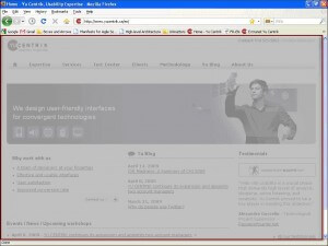
- Browser chrome (title bar, status bar, scroll bars, toolbars, tabs)

What we found about user configurations …
A series of remote tests allowed us to collect screen captures from 51 participants. These remote tests were conducted on different types of websites: tourism website, sport clothing retailer website and a web-based human resources management application. The studies were conducted in July 2007, December 2007, February 2008 and June 2008.
Resolution Results:
In our studies, users are typically asked to have a minimum resolution of 1024 x 768, so we cannot confidently say how many users still have resolutions below 1024 x 768. However, during recruiting we do sometimes come across users still working with 800×600. Based on screenshots from a sample of 51 users:
- 60% of users had a 1024×768 resolution
- 25% of users opt for a 1280 resolution (1280×1024, 1280×800, 1280×768)
- 20% of users had a widescreen resolution
- 8 different resolutions were identified
While 1024 x768 remains the popular choice, we note that screen resolutions are increasing and varying.
Number of Toolbars Results:
For the purpose of our analysis, toolbars include: the menu bar, address bar, navigation bar, specialized toolbars (Google bar, Yahoo bar, etc.) and tabs (for tab navigation). Our remote test studies revealed interesting results regarding the number of toolbars.
Typically, a minimum of 2 toolbars is guaranteed. The users in our study all used Firefox or Internet Explorer. These browsers will typically have at least 2 toolbars by default, namely the Menu bar (File, Edit, View, etc) and the Address bar. In the case of IE 7, some users will actually have a third level by default since the initial page of the browser is tabbed.

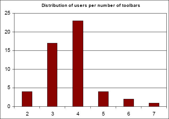
Most users have 4 toolbars. On average users had 3 to 4 toolbars, but most users have 4 toolbars.

However, one user had up to 7 toolbars.

The toolbars vary across users, but the most common of toolbars are:
- menu bar
- navigation bar
- address bar
- combined navigation / address bar
- Google bar
- tabs
Status bar is present. 49 out of 51 users displayed their status bar.
Low resolution does not mean less toolbars. While we may think users with more toolbars will have higher resolutions, that was not the case, the users with 6 and 7 toolbars both had a resolution of 1024×768.
Then, how big is the average safe zone?
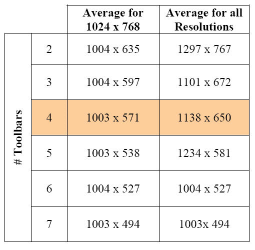
Based on our results, the safe zone in the browser (visible portion of the website) can vary in height from 494 pixels to 912 pixels and in width from 997 to 1138 pixels depending on resolution and number of toolbars.

What does it mean for website design?
The safe zone is key in the success of a site. Despite the great design of a website, brilliant navigation, innovative concepts, if a user cannot see important elements like the navigation bar because they were placed below the visible portion on their screen, the entire user experience will suffer.
One must consider that the actual safe zone is not the full resolution, because users see web pages through their browsers. Designers should continue to optimize their design for 1024×768, but the design should be sufficiently flexible to accommodate 800×600 and the increasing resolutions, and the presence of toolbars:
Design with the safe zone in mind. Primary and crucial content should be available within the safe zone (first-fold of the page). The main navigation elements should not be hidden.
Set safe zone width to 960 pixels. The width should not go above 1003 pixels. However, it does not mean one has to always design at the edge of the page. A width of 960 is a good round number divisible by 10 and 12 which can be very practical for visual designers.
Set safe zone height to 540 pixels. The height is affected by the number of toolbars. Considering a resolution of 1024 x 768 and the numbers of toolbars as 4, the height should remain at least below 570 pixels. However, 540 pixels are divisible by 10 and 12 which is convenient and right under the minimum height found in our analysis of screenshots.
Be flexible. In the end the site should be flexible, so that users with any resolution or any number of toolbars will be able to navigate and not be lost.
7 Comment(s)
Thanks for charging this extremely valuable reasearch. It confirms a lot of things.
*Typo: sharing
Thanks Alice, this is gold information for every Web designer.
Seriously, I can’t even count the amount of times I’ve been google-hunting for this sort of thing. My new question is about context. In what usage contexts are users willing to jump the ‘fold’? For instance, I personally don’t mind long scrolling pages when I’m reading an article (I hate having to click next, next, next).
I keep asking myself if these people had installed all these toolbars themselves consciously or if they had them installed automatically. Some people don’t even notice that all these bars take a lot of their browser’s real state and don’t realize they don’t use them at all. They think it’s just normal to have them, that a browser is supposed to have these bars.
Marcio, you’re reminding me why I love Chrome.
And me why I love my mac 😉